

WAKE UP: Build Statistics with Python
WAKE UP: Build Statistics with Python

“Winners never quit, and quitters never win.” — Unknown
Happy Sunday Friends!
I hope you’re doing great. We have a packed schedule for today, and many different points to cover:
1. Evolution of this Substack;
2. Personal update on my trading;
3. We build a statistical tool with Python;
4. Next articles’ ideas.
If you’re just interested in the coding part, just skip to part III.
1. Evolution of this Substack
We are on track to achieve one of my 2023 goals: reaching 5,000 subscribers on The Statistical Edge. I picked a high number to motivate me, and so far, the feedback has been great.
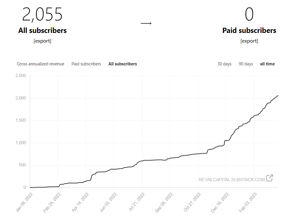
I don’t really understand where the growth is coming from, as very few people recommend me, and their recommendation only accounts for 6% of the total subscribers. I didn’t have any viral posts either.
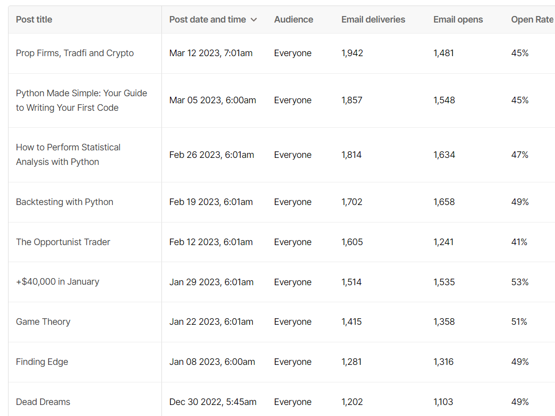
On average, and despite the growth, the open rate of my Sunday emails is stable at around 45%.
I might play around with my title and the hour I send my email to see if it impacts positively or negatively the open rates in the next few weeks. Please help me by answering the below polls.
Thank you.
In other words, I don’t know why this Substack is growing at this rate, but thank you! It’s a great experience and I encourage anyone who’d like to take on that path.
I received A LOT of emails over the last 2 weeks that are unanswered, please bear with me as it takes time to provide quality answers. As usual, trading remains my #1 priority and then I answer you.
2. Personal update on my trading
If you follow along, I had a crazy start to the year, making more than $50,000 in the first 40 days of the year. My yearly target is $80,000 after taxes. I want to consolidate my foundations to go for exponential growth next year. As said after my withdrawals, my plan was to reduce risk and avoid giving back the profits in February/March. I’m glad I stuck to that plan, and almost only traded from my prop firm accounts.
I lost a few APEX accounts, passed some new APEX accounts too, failed a 200k FTMO, tried again, and am now in phase 2 of it, and passed a 50k FTMO.
Overall, my prop accounts start to look really good, and I can trade more freely.
My goal is to have $100,000 of real capital with prop firms by the end of the year with $100,000 of withdrawal.
To give some perspective, the last $300,000 account I passed on Thursday with Apex only allows me to lose $7,5000. The $200,000 FTMO allows me to lose $20,000. I’m about halfway there as of today for both goals. Looking good, but let’s not jinx it.
Here’s the equity curve for my last $300,000 APEX, trading $NQ only.

In my opinion, the best path to get capital is:
train yourself on the free FTMO challenges;
when you passed a few, get the APEX ones (cheaper).
APEX runs promotions all the time, use them to your advantage when you feel ready. There’s never been a better time to raise capital for your trading. My $300,000 Apex cost me only $131, that’s crazy!
The 80% promotion runs until March 21.
I love Topstep and FTMO too, but they are more expensive.
I’ll keep building prop accounts in the next 1.5 months and then will increase the pace of my trading before the summer, as we all know July and August are slower months.
3. We build a statistical tool with Python
Finally, the part you’re all here for!
Let’s start by sharing my first python web app I built over the last few weeks with ya’ll. I shared it on my Twitter last Sunday but not here yet. It had more than 500 unique users in the first week and probably thousands of visits, crazy!

Ok, now to the real stuff (promise)!
As you know, big accounts on Fintwit love to make random claims to gain clout. If you build your statistical tool, not only it will improve your trading, but you’ll be able to secretly laugh at many fake traders on the bird app.

In case you didn’t notice, I just did a random claim in the previous section ‘as we all know July and August are slower months.’ Did you take my words for granted?
I hope not! So… let’s build some statistics around that. Spoiler alert, I’m building a new web app that will allow the user to look at various statistics for any tickers. I will build it in public with you through that Substack over the coming weeks/months depending on my motivation. Today is step 1, the app will look ugly but stay tuned for the amazing transformation that is about to happen.
As usual, I’m not allowed to share Polygon data as I don’t have a commercial license, so I’ll keep using the yfinance API.
So, what do we want to know? We want to know if markets are slower during the summer months of July and August. How do we measure that? Plenty of ways to do so:
Average daily range;
Average returns;
Repartition of the distribution of the daily returns;
VIX;
Volume;
and many more!
In today’s article, we’ll focus on the average daily range for $QQQ.
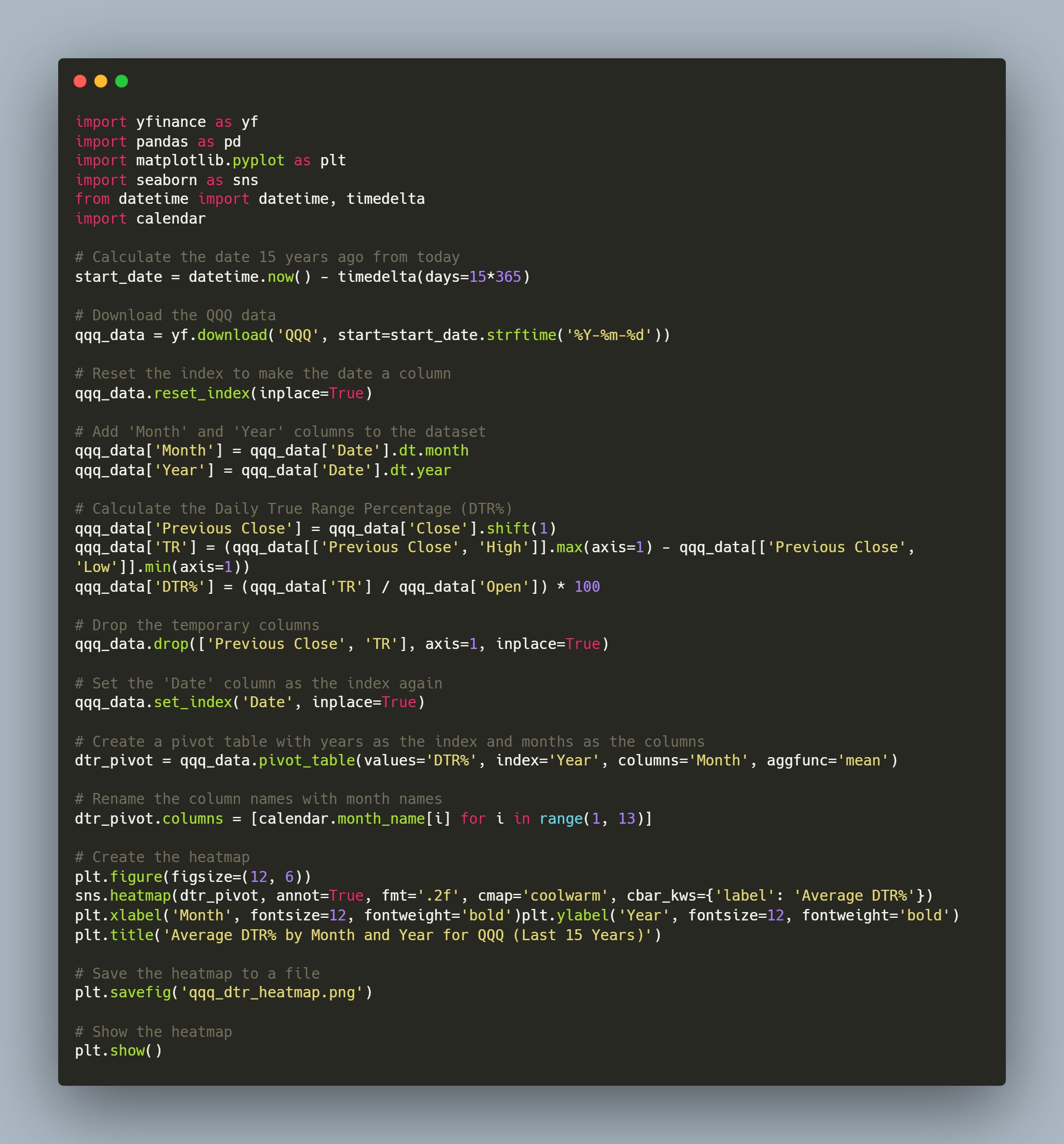
In case you were still not convinced how easy it is to get data through the yfinance API, here’s your weekly reminder.
5 lines of code and we have it. The last 5 years of QQQ 0.00%↑ daily data.

We want to add the month and the year as two new columns so we can track the average daily returns during July and August against the rest of the year.

Good. Now we need to add the daily true range. I will calculate it as the difference between the maximum of the daily high and the previous day's close (in case of a gap down) and the minimum of the daily low and the previous day's close (in case of a gap up).
Then, we divide it by the daily open to normalize our daily true range %. We call this new column ‘DTR%’. Boom!

Looks like we can start doing our analysis work with this dataframe.
We will first look at the average DTR% for the months we’re interested in, and then, we’ll have a deeper look through the distribution of these data points.
I like the simple bar chart to have a first high-level view and see if anything stands out.
Here are the results.
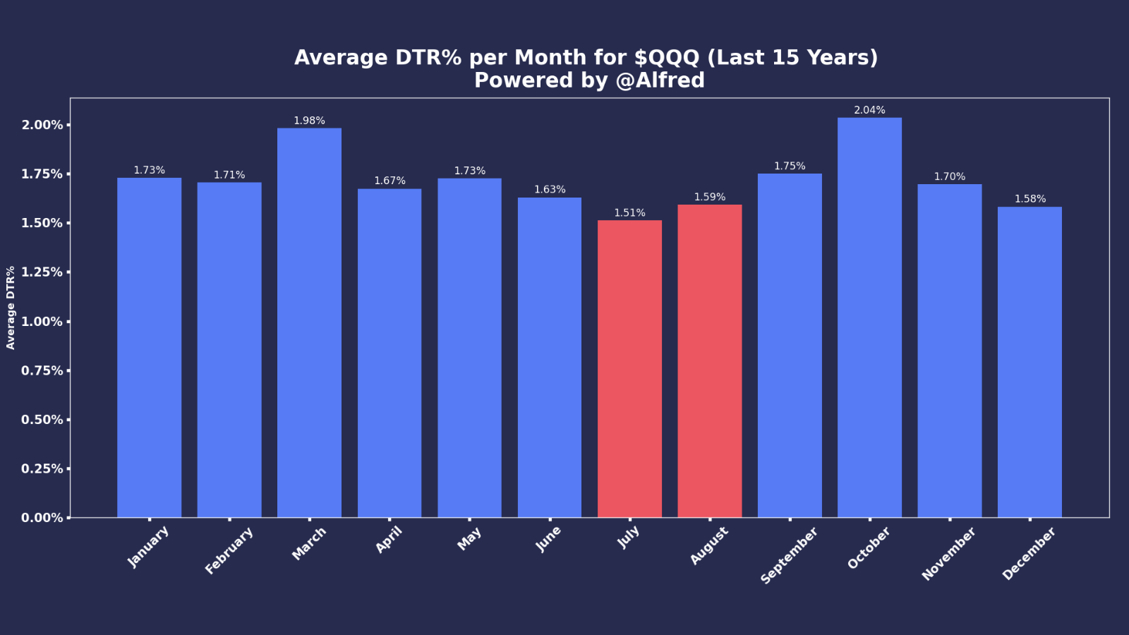
In red, we have July and August, with an average DTR% of 1.51% and 1.59%. We can see that, with December, these are indeed the slowest month of the year in terms of volatility (with our definition of volatility being the DTR%).
I’m glad I didn’t lie to you. Now, even if this is true on average over the last 15 years, does it remain true over the most recent years? I love a good old heatmap to visualize this. The idea is to have one axis for the years, and the other one for the month. Then, we can clearly see the evolution over the years of the volatility per month of the year.
Ready? Let’s get some Python magic.

So what’s happening here? It’s a pretty busy chart. The heatmap shows you, via a scale of color, the highest and lowest value in a dataframe. In our case, it’s the evolution of DTR% over the months and years since 2008. First observations:
WTF happened in October and November 2008? (wrong answers only)
Then, WTF again, March 2020? No idea what that was, but the market went crazy, 6% average daily range. Probably some weird pangolin story.
More seriously, I find this graph very interesting, as we can see that except in 2020 and 2022, the average daily true range on QQQ 0.00%↑ is indeed much lower in July and August.
More generally, since February 2020, the volatility has been there, and we don’t know when it will disappear. We have to enjoy the little things until volatility goes back to a lower regime.
I could go on with more graphs, but I guess you got my point. I hope this article helped you understand how to build some statistics and test some ideas. Always challenge people rather than believe what they say (me included).
Here’s the code to extract the data and create the heatmap (I won’t answer email questions to it, do the work).
Another quick example that I’m adding this morning at the last minute.


I hope I made my point.
4. Next articles’ ideas
I had so much fun building the options web app that I will build another web app, with you and in public, to pull up a wide variety of stats for any given ticker.
A few ideas I have at the moment:
Show the distribution of returns against a pool of tickers in the same industry;
Seasonality;
Outliers;
Maybe some short-term machine learning prediction just for fun.
Feel free to share any ideas you have.
As usual, it was a lot of fun writing this article. It’s quite funny that I never run out of ideas, and my list just keeps getting bigger week after week.
Keep clicking!
Thanks for reading, folks!
It would really mean a lot if you could share this article. One of my goals for 2023 is to have 5,000 subscribers on this Substack, and I would be grateful if you could help me grow it.
Until then, stay safe.
- Retail
PS: I had a few people reaching out to me on Twitter asking why they were not receiving my emails anymore.
📬 Please ensure I’m not in your promotion/spam inbox. An easy way to ensure you’ll receive my articles is to answer this email with “Received” to add The Statistical Edge to your main inbox.
Useful links
📝Previous articles: read here
Apex affiliate link | Code = RETAILCAPITAL (50-90% off)
Twitter: @itsonlymoney12
📩 retailcapital9@gmail.com
Great article! I am working on implementing some of what I have learned from you but I keep running into limitations on what I can do with yfinance data. I am wondering if you have any recommendations on how to get futures data (like 1 minute data) going back at least 10 years. I understand it is expensive but I am wondering if you know what is the best/cheapest solution?
I like the quote haha. Two more:
"To finish first, you must first finish"
"Winners are just losers who didn't give up"
Keep up the great work my friend and congratulations on crossing the 2k milestone!