

Statistics for Dummies, Trading Edition
Statistics for Dummies, Trading Edition
Volume I: The Foundation

35 years ago, I had no idea what statistics meant. Then, my parents met, had sex, and I was born. That’s how simple statistics are.
If you’re unfamiliar with statistics, probabilities, and distribution, grab a coffee and get ready to have a life-changing experience! I’ll try to make it worth your time. Hopefully, it won’t turn you into a worse trader.
My goal is that by the end of this article, you will master these three topics:
Difference between statistics and probabilities;
How to read statistical charts;
How to use statistics for your trading.
Difference between statistics and probabilities
Before learning what statistics and probabilities are, let’s start by looking at the difference between them. Many people are confused and use both terms interchangeably, which is incorrect.
Statistics involves the calculation of the frequency of past events.
Probabilities involve the calculation of the likelihood of future events.
If you want to predict the price of TSLA 0.00%↑ tomorrow, you will use probabilities.
If you want to know what percentage of the time TSLA 0.00%↑ closed below its 200-day Simple Moving Average over the last five years, you will use statistics.
Artificial Intelligence (AI) is now quite popular, and you probably heard of chatGPT over the last few days. There is no need to dive into Machine Learning and co. to use mathematics in your trading. Statistics are a great, easy and fun way to improve your trading.
Statistics - “The practice or science of collecting and analyzing numerical data in large quantities, especially for the purpose of inferring proportions in a whole from those in a representative sample.”
We often see *experts* on Twitter discussing events with less than five occurrences (like 2008 vs. 2022 charts comparison). From a mathematical perspective, this is pure nonsense. We need a minimum of occurrences before being able to draw reliable conclusions. There is no hard rule, but usually, we say that a statistic is reliable when we have at least 100 occurrences. The same goes with your backtests; if you’re a swing trader and your system generated 3 signals in the last 10 years, how confident can you be that it’s reliable? How confident are you to put real $ on the line? I wouldn’t, but that’s just me. An idea could be to look at uncorrelated assets and run this backtest on them to increase the size of your universe.
Probabilities - “the extent to which something is probable; the likelihood of something happening or being the case.”
What is the probability of TSLA 0.00%↑ being up tomorrow? Let's say that 60 of the last 100 days were green days. The probability of TSLA 0.00%↑ being up tomorrow is 60%. In an ideal world. In reality, we don't know because each of the previous 100 days had specific conditions. Statistics will help us understand those conditions.
“You can view probability as calculating the likelihood of events in an ideal world, whereas statistics measure the extent to which our world is ideal.”
I asked chatGPT to explain what statistics are, and it came up with a pretty good answer. My days on this platform are numbered.
How to read statistical charts
Let’s do the fun stuff now. You’ll soon be able to brag with your friends, explaining how to read those charts we see all over the news.
The histogram chart
Let’s start with a classic: the histogram chart. A histogram chart is used to visualize the distribution of the possible outcomes for a specific event through horizontal bars.
Example
In this example, we want to look at what happened in the past on the Nasdaq after a green day of at least +3%, followed by a consolidation day. What happens on the third day?
I gathered all the historical daily returns on the Nasdaq since 2000 and added a filter to show only the records for which we had this pattern:
Day 1: +3% green day or more
Day 2: consolidation (return between -1% and +1%)
We look at the return on the third day when the two previous days follow the pattern of 1. and 2.
Here is the histogram chart.

How to read it?
Y-axis: The higher bar, the more occurrences we had.
X-axis: The returns on the third day.
FYI, the X-axis is the horizontal axis, and the Y-axis is the vertical axis on the left.
We can see that the results look uniform. There is some symmetry around the 0% return vertical line. We call this a normal distribution. There are a few types of distributions, and the normal distribution (or Gaussian) is the most famous. A normal distribution means that, on average, we can expect the outcome to be the value in the middle vertical dashed line (here, it’s 0). The farther we are from this dashed line, the fewer occurrences we see. In other words, the extreme outcomes are on the far left and right sides, and the most likely outcomes are in the middle. This is sometimes referred to as “tail risks”. Tail risk is an event with a low frequency but high severity (black swan).
If we look at the blue text on the chart, we can see that we had five occurrences where the Nasdaq had a return between -4.5 and -4% after the pattern we described earlier.
Do you know where you might use distribution without realizing it in your everyday trading? Volume Profile! A Volume Profile is simply the representation of the distribution of the volume by price level. Let that sink in.
Any question?
Scatter plot
A scatter plot uses dots to represent values for two different numeric variables.
Example
Let’s say that for some obscure reasons, you’d like to know how the Nasdaq’s returns compare to the VIX’s returns. Maybe there is some sort of correlation?
Don’t worry about data collection, Alfred (my bot) took care of it for us. After collecting the returns of VIX and $NQ since December 2021, we analyze the correlation between these variables by creating a scatter plot chart.

How to read this chart?
The X-axis represents $NQ returns
The Y-axis represents VIX returns.
Each point on the chart represents, for a given day, the returns of both $NQ and VIX. The red dot highlighted by the red arrow shows a $NQ return of around 1% for a VIX return of around 5%.
Why is this type of graph useful? Because it allows you to see if there is some trend quickly. I added a red trend line to show the relationship between these two variables. The trend line starts at the top left and ends at the bottom right. It means that there is a negative correlation. When one is big, the other one is small. If the VIX closes big in the green, NQ tends to close big in the red.
There are many more statistical charts, and I will go through them in the future volume of this new series if there is enough demand.
How to use statistics for your trading
There are plenty of ways to use statistics for your trading. The only wrong way to use statistics is not to use them!
I use statistics daily to help me assess which type of day we are in and what the impact could be on the short-term future.
Some examples below, where statistics helped me answer some questions I had.
“Is the Christmas rally starting in December?”

The answer? NO!
"Is NVDA 0.00%↑ correlated with other stocks in its sector (Information Technology)?"
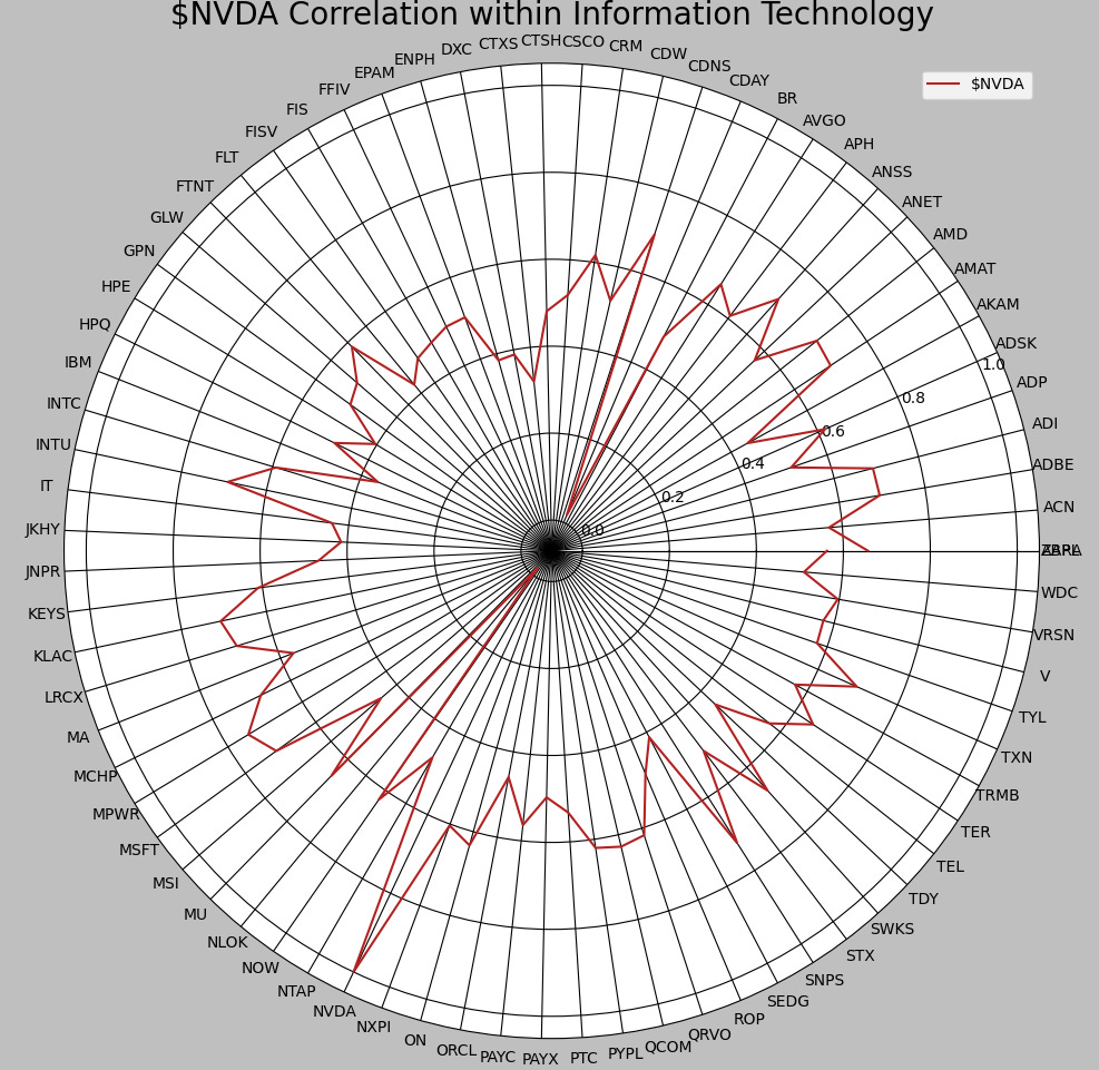
Yes! CDNS 0.00%↑ , TXN 0.00%↑ , and more are correlated with NVDA 0.00%↑.
"Is it likely to have a green week following a -10% return week on NVDA 0.00%↑?"
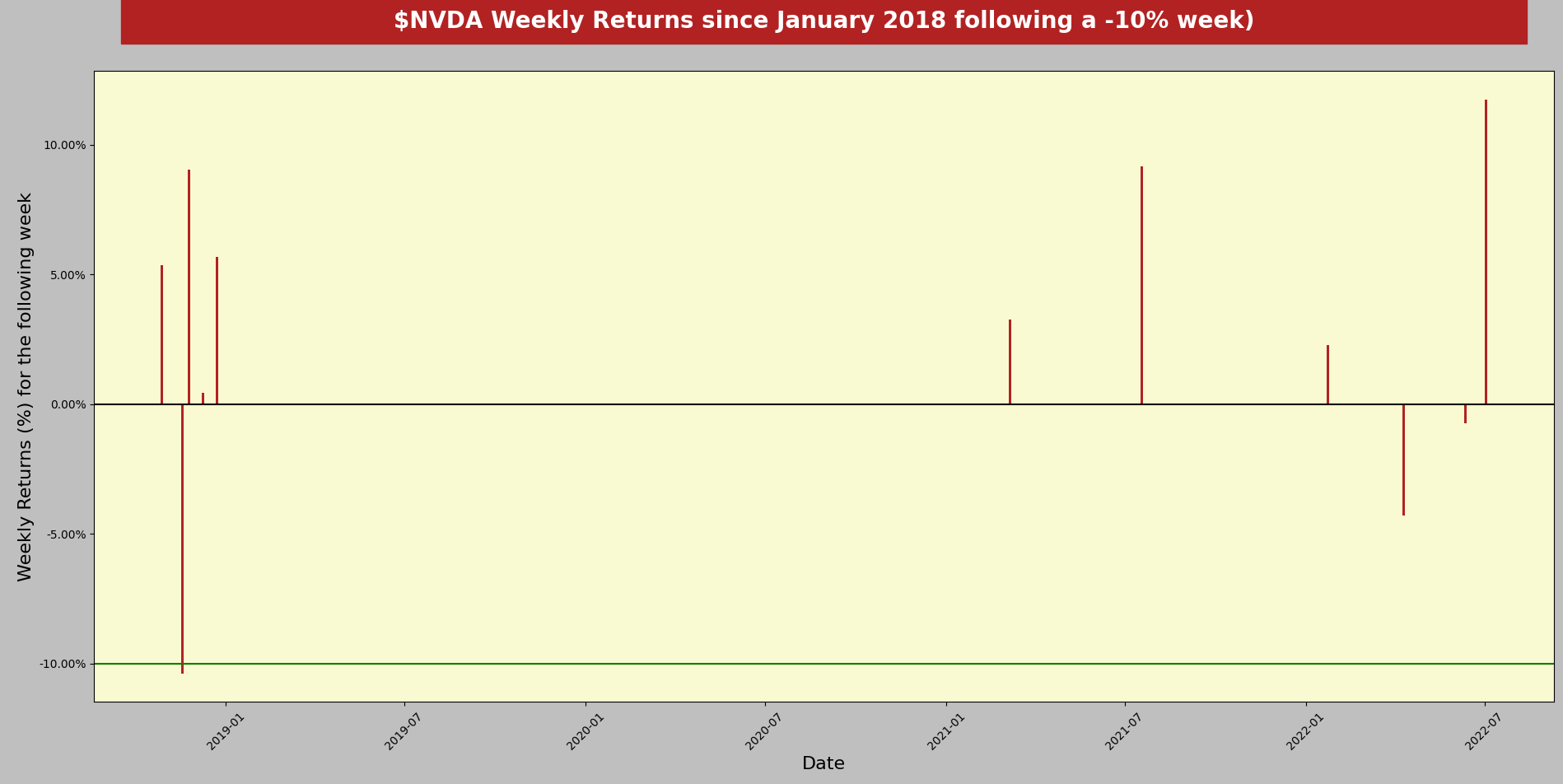
Yes! Most of the horizontal bars are above the 0% horizontal black line.
I hope this was worth your time and that you learned a thing or two. There are countless applications to trading and other areas of life, and as I often share on my Twitter, Python offers many easy ways to build various statistics.
Thank you for reading.
- Retail
Useful links
📝Previous articles: read here
Twitter: @itsonlymoney12
📩 retailcapital9@gmail.com
Thanks Retail! Consise and informative.
Thank you.