

How to Perform Statistical Analysis with Python
How to Perform Statistical Analysis with Python
Episode XI

"Statistics is the grammar of science" — Karl Pearson
Happy Sunday, friends!
I hope you guys had a great week and a warm welcome to the new 150 readers of the Statistical Edge. Thank you to everyone who is reading and interacting with my work. It has been pretty clear from the feedback I received last week that you want more Python-related content, so here we are. I love writing about Python. Writing quality content about programming takes more time than the other articles. I’m not sure if I’ll be able to maintain 3 good Python articles per month, but I’ll give it a shot. My two only priorities are:
Having fun writing;
Providing value.
Today, we will discuss statistical analysis applied to trading.
Please take a few seconds of your time to share this article.
Table of Contents
History of statistical analysis
How I use statistical analysis in my trading
Coding Example: understanding the behavior of a new asset
Bonus: Backtesting the wicks
I will walk you through my programming process in a more detailed way than usual. The idea is to show you some of the best practices I use in my daily programming activities. It might not be the best, but it has done well for me so far.
I was supposed to release my article about options, but I postponed it as I’m waiting for someone to review my code to ensure I share accurate data with you.
But first, a bit of history…
What is statistical analysis?
The roots of statistical analysis can be traced back to ancient civilizations, where people used statistical methods to make decisions based on data. For example, ancient Greeks used statistics to help them make decisions about political and military strategy, and Chinese scholars used statistical methods to study the weather and make predictions about crop yields.
However, the modern field of statistical analysis began to take shape in the 18th and 19th centuries with the development of probability theory and the use of statistics in scientific research. The mathematician Pierre-Simon Laplace is credited with introducing the concept of probability and developing many of the foundational principles of statistical analysis, while the statistician Adolphe Quetelet is credited with developing the concept of the "average man" and applying statistical methods to the study of social phenomena.
In the 20th century, statistical analysis became an essential tool in scientific research, particularly in fields such as medicine, economics, and psychology. The development of computer technology and the availability of large data sets have further expanded the use and importance of statistical analysis in fields such as business, finance, and engineering.
Today, statistical analysis is a critical tool in many fields, providing researchers and decision-makers with the ability to make sense of complex data sets, identify trends and patterns, and make informed decisions based on empirical evidence.
How do I use statistical analysis for my trading?
You know I’m always a bit too curious, and even if I only trade $NQ and $BTC, I love analyzing other assets. I didn’t use to trade $BTC by the way, but I did extensive research on it before trading it. Who knows, maybe next month I’ll be trading stocks. My point is if you build a script that allows you to quickly analysis any assets, it can only be helpful to your future you.
What I’m particularly interested in is the following:
What is the volatility?
Are there statistical anomalies?
How does it compare to $NQ?
Are there more opportunities than in $NQ?
Can I automate strategies on this asset?
And many more.
Today, we will mainly focus on the first two bullet points.
Time to get your coffee refill, and let’s get to work. Yay!

Coding Example: understanding the behavior of a new asset
We will analyze $BTC with the help of the Polygon API and Python. In terms of libraries, we’ll be using the following:
Numpy
Matplotlib
Pandas
Note: This is an introduction to statistical analysis. If I wanted to cover it all, writing this article would take me days. I cherry-picked a few topics that I find interesting, but it goes much deeper than that in practice.
If you want to follow along, I strongly advise using chatGPT to help you with the coding part. ChatGPT is an absolute game-changer for anyone who wants to learn programming (and other stuff, too, I guess). Don’t be scared to play with it. I built a website with it in a week and had no prior knowledge of coding websites. This is a revolution for retail traders like us, an almost free expert available 24/7. Whilst most people use it to get likes and views, I use it to build robust trading tools.
So, where do we start? It can be intimidating at first. The best thing is just to start and keep the lines of code flowing.
To show you how easy it is to get data through an API, here are my two lines of code that allow me to get 50,000 1-minute candlesticks on $BTC.
As you can see, it’s pretty straightforward if you read each part of the ‘equation’. I couldn't imagine doing this manually or through Excel.
However, I always prefer to start with daily bars and finish with lower timeframes.
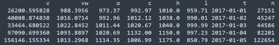
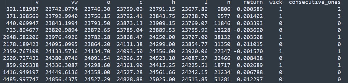
Some explanations of the data we got from this extract:
v is for volume;
vw is for VWAP;
o/c/h/l are for open, close, high, and low;
t is for timestamp; and
n is the number of transactions during that timeframe (here, we have 1-day candlestick bars).
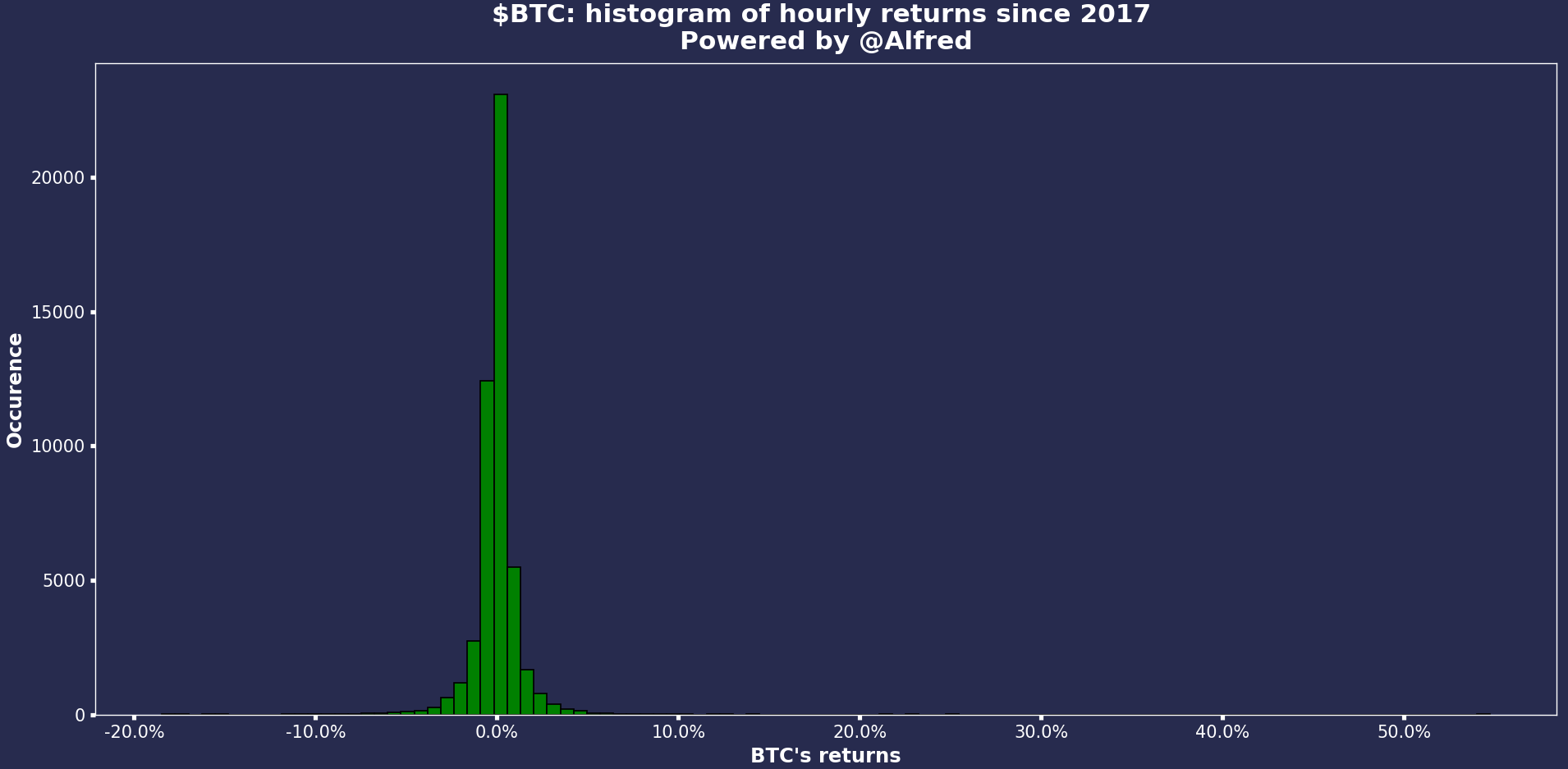
Daily returns since 2017
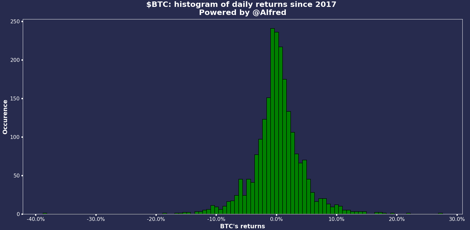
As we can see, it looks like a normal distribution. On most days, the returns are around 0%. What is absolutely crazy is the number of days where the returns are above/below 5%. Looking at the equivalent on $NQ, you’ll see that the volatility is drastically reduced. Yet, $NQ is a volatile index. This is a great way to visualize tail risk btw. Look at the extremes!!
This simple graph told me I had to trade $BTC. At least try. Because the volatility is here, it’s undeniable. More volatility = more opportunities.
As a side note, here’s what you could ask chatGPT to help you plot a histogram with Python.
Hourly returns since 2017
Let’s look at the equivalent on smaller timeframes.
A quick note, the Polygon API says that we can query data by batches of 50,000 candles. This is true for 1-minute candlesticks, but not for higher timeframes (or I do something wrong). Thus, I had to update the scripts to extract month by month the hourly candles.
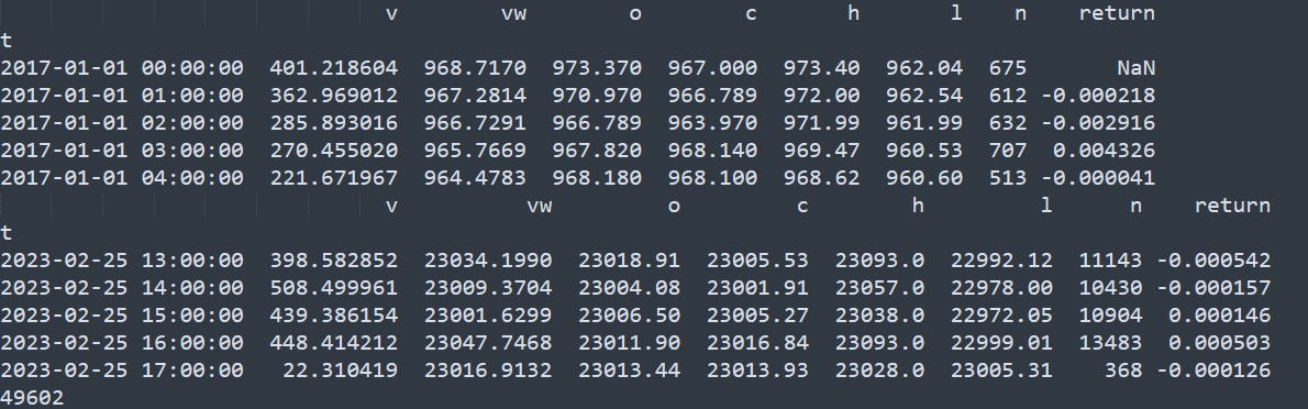
As it’s always important to check your results in programming, in the above screenshot, we can see the beginning of the total dataframe, starting in 2017 and finishing in 2023. There are 49,602 rows (so 49,602 hours) representing the 6 years of data (there are c. 8,760 hours per year).
The results look funny with a fat-positive tail. Did we really have a one-hour candlestick resulting in a +50% increase in the price? We need to check that.

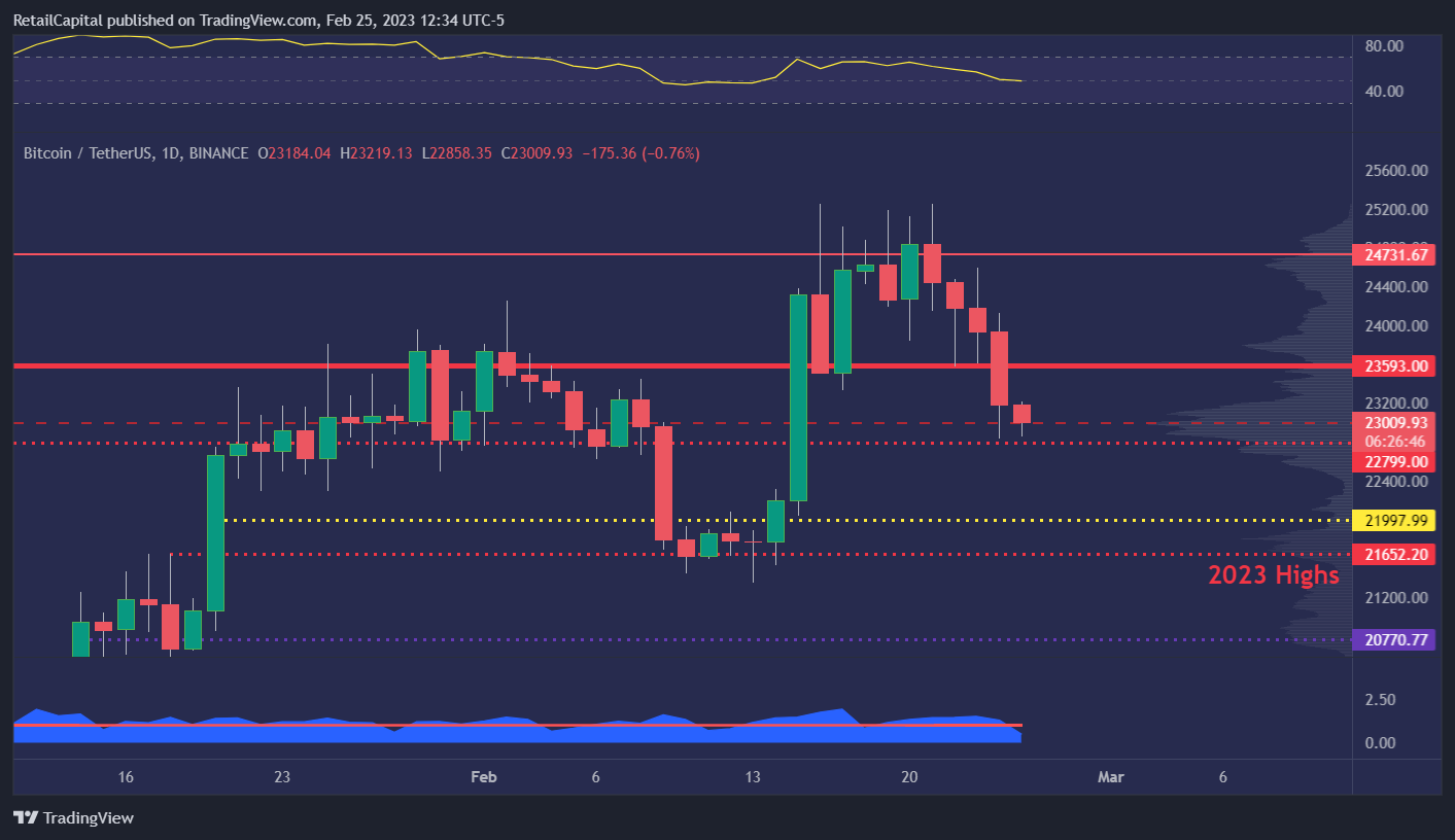
Apparently, on January 1, 2018, and January 1, 2021, we had a +25% and +55% 1-hour increase. It seems a bit suspect that both outliers are on the first of January, but let’s check on TradingView…

As we can see, there was no crazy movement on January 1, 2021. Same for 2018, but I’ll spare you the additional graph. I could have removed that section and put the correct chart directly, but I wanted to show you the importance of checking every step of the process.
Here are the final results:
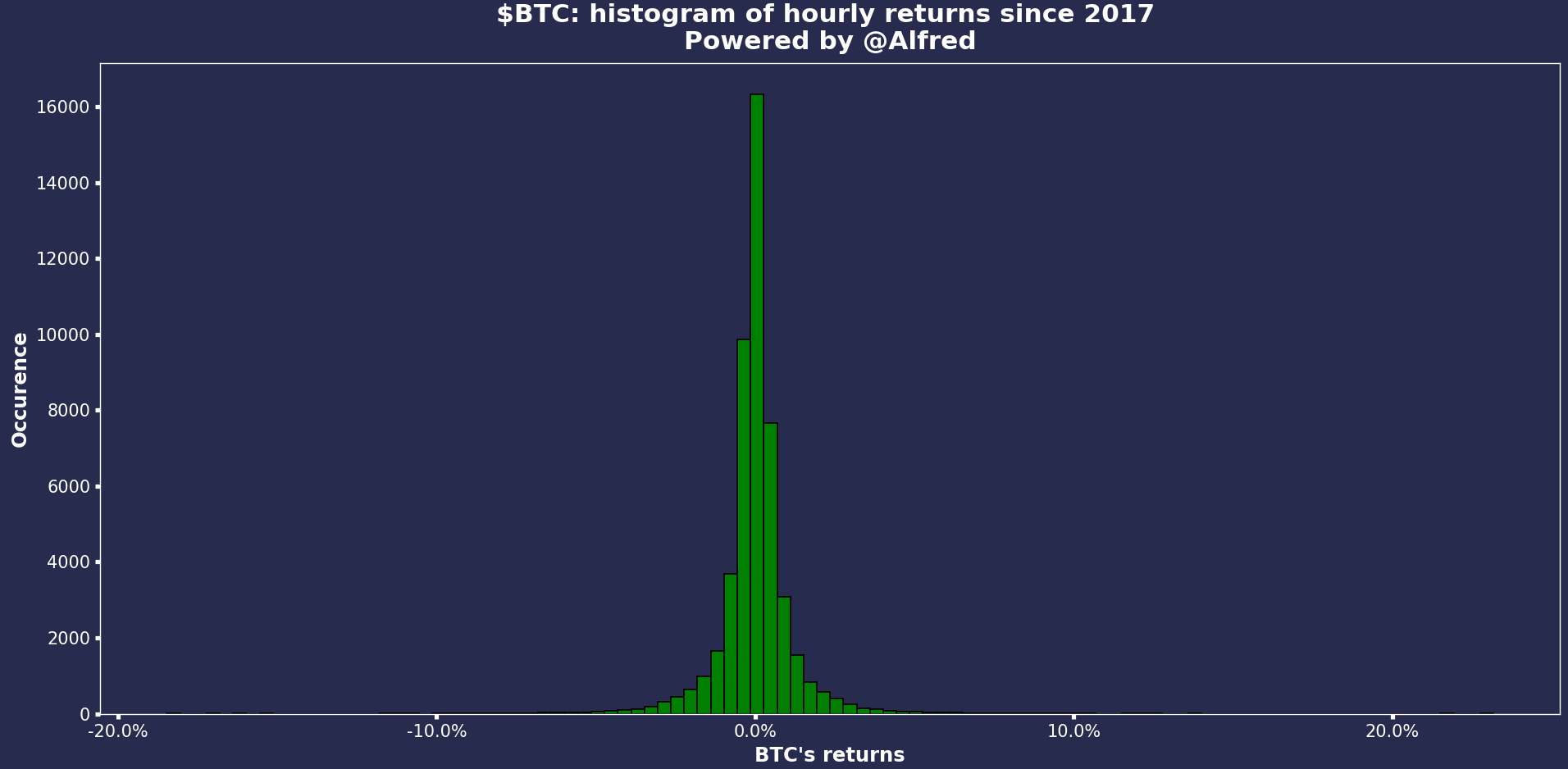
It looks normal now. We still had the occasional flash crash (both up and down), but overall, it’s a beautiful repartition. We have a clean dataset of 50,000 hourly candles in just a few seconds. Pretty cool.
Do you see any difference in the repartition between the daily and hourly candlesticks?
There are plenty of other things to look at for performing statistical analysis, but I want to get to the fun part.
If you made it thus far, you should be compensated for your patience with a little backtest I wanted to test.
Backtesting with the wicks
Let’s try something fun. If you haven’t opened the daily chart of $BTC yet, let me pull it out for you. This week, we had not 3, 4, or 5 but SIX wicks on the daily chart. Mind-blowing. Ok, maybe I’m getting a little bit too excited. But let’s see.
Naturally, it gave me so backtesting ideas (Robert, if you read this… :)).
I don’t have any bias, so I’ll look at the hourly dataset we built earlier, count the consecutive wicks, and look at the following movement when the wicks stop.
The idea is to see if there is a strong momentum once we break that series of wicks (e.g., rejection. At least, that’s how I interpret it. As usual, not financial advice bla bla bla… I’m just a nerd having fun).
Python is smart, but it won’t know what a wick is unless we describe it to him.
Let’s say that a candlestick is a wick if the body is smaller than 40% of the total candle. Why 40%? Because I want to. In theory, you would like to try different thresholds.
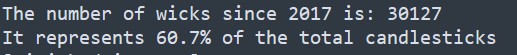
Wait. What? 61% of the hourly candles have a body smaller than 40% of the total candlestick. That seems counterintuitive. Now, let’s count consecutive wicks.
Boom. Magic. We have an additional column showing the consecutive count of wicks. Let’s look at the repartition of consecutive wicks.
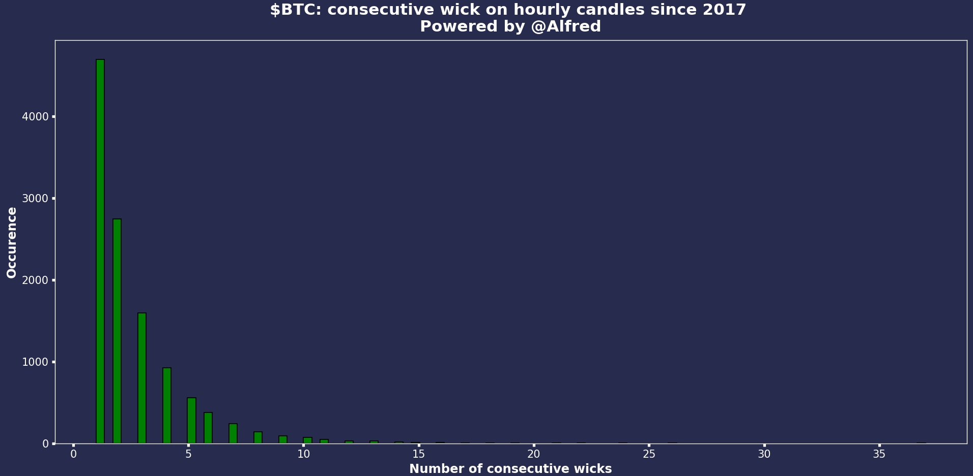
Ok. So most of the wicks are isolated. We see a 35 tagged on the right of the chart; not sure when it was, but that’s pretty crazy.
Something to remember: when you’re trading in real-time, and you have two consecutive wicks, there’s no way for you to know at that time if the next candle will be another wick. It’s easy to fuck up your backtest by considering unknown data.
Let’s take 5 wicks. What type of movement do we see once we have at least 5 consecutive wicks?
My ‘bias’ is that once we get through the wicks (or if prices reject them), we shall see some momentum and a stronger-than-usual movement. Will the data prove me wrong?
Here are the draft results.
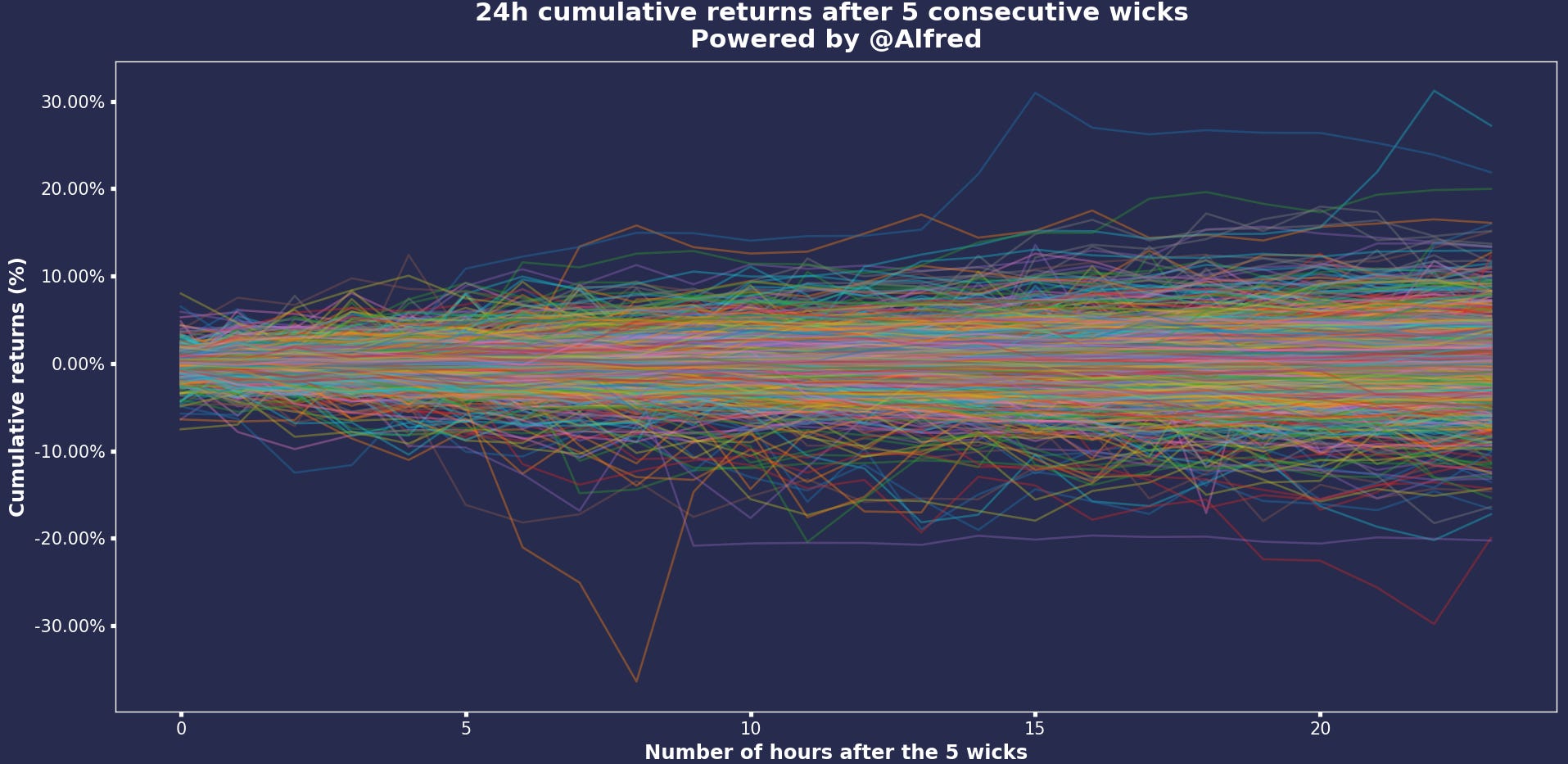
Firstly, remember we had around 1000+ signals in our dataset, which is significant.
Secondly, these are draft results, so I need to check them.
What I see, though, is an increase in volatility and a lot of noise (as usual). We have a good chunk of cumulative returns after 24h between +/- 8%. However, given the number of lines on this chart, it’s hard to tell which if there are reversals. To tackle that issue, I’ll try to present these results differently.
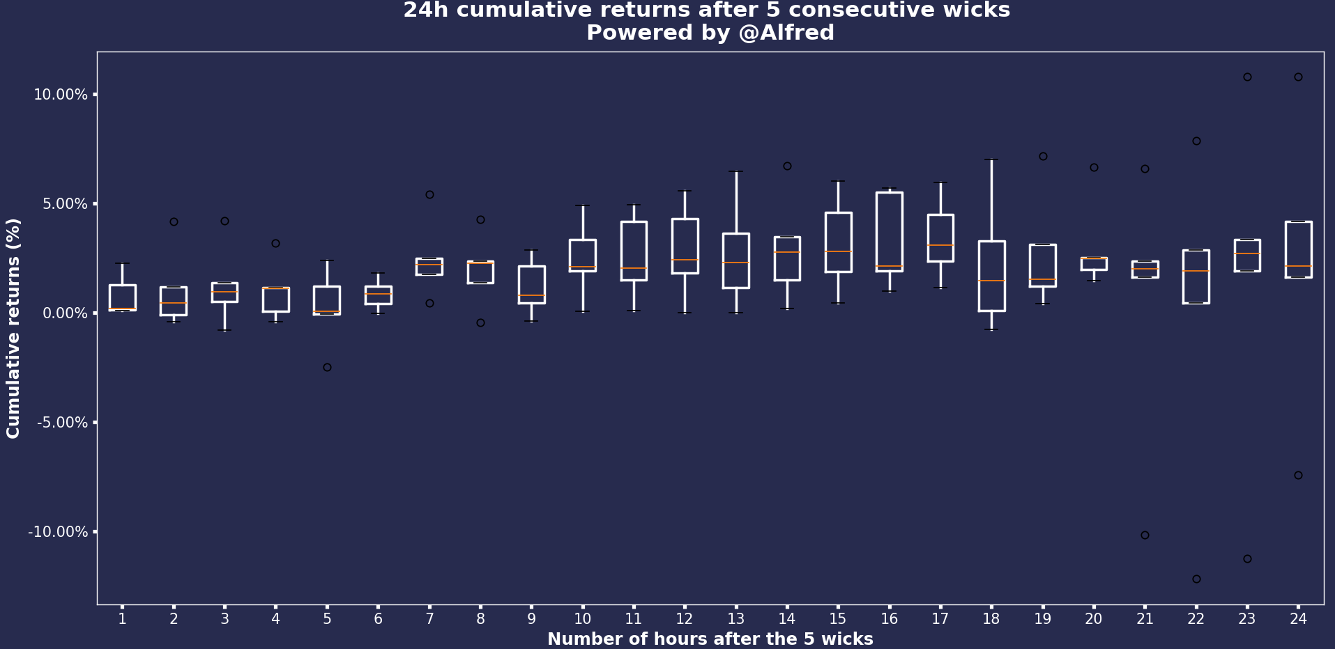
Looking at these boxplots, we can see a difference between both charts. One is wrong. I’ll leave it this way because that’s programming most of the time: debugging. Which one do you think is correct and why? (Kind of difficult without looking at the code tbh).
This concludes today’s article!
I hope you enjoyed that read, it definitely took me much longer than expected, but I think it can give you a few ideas for your trading. Let me know what you think, and thanks to those of you who like/share the article.
Thanks for reading, folks!
It would really mean a lot if you could share this article. One of my goals for 2023 is to have 5,000 subscribers on this Substack, and I would be grateful if you could help me grow it.
Until then, stay safe.
- Retail
PS: I had a few people reaching out to me on Twitter asking why they were not receiving my emails anymore.
📬 Please ensure I’m not in your promotion/spam inbox. An easy way to ensure you’ll receive my articles is to answer this email with “Received” to add The Statistical Edge to your main inbox.
Useful links
📝Previous articles: read here
Apex affiliate link | Code = RETAILCAPITAL (50-90% off)
Twitter: @itsonlymoney12
📩 retailcapital9@gmail.com
so inspiring! these writings are fantastic!